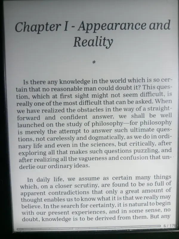
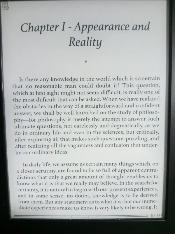
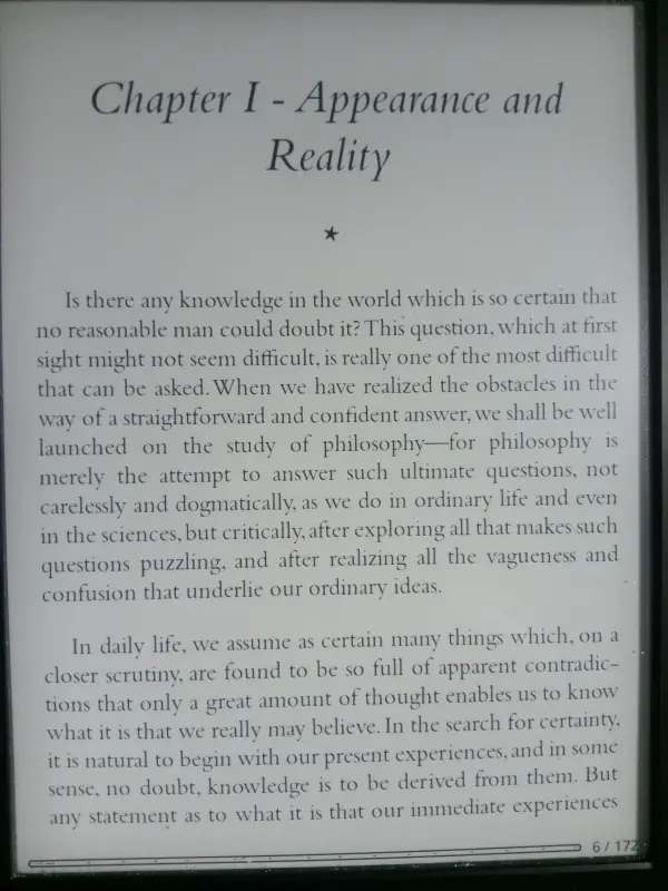
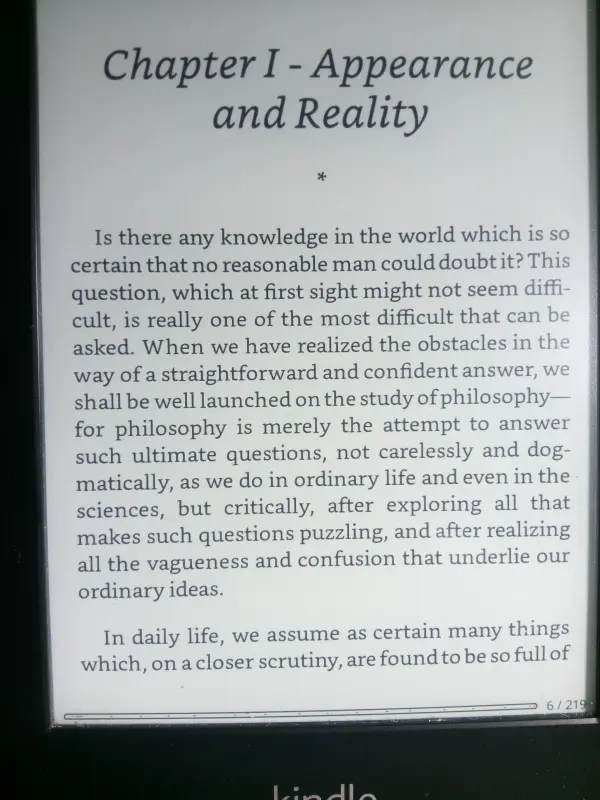
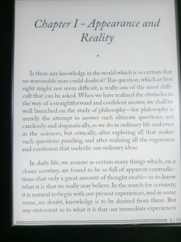
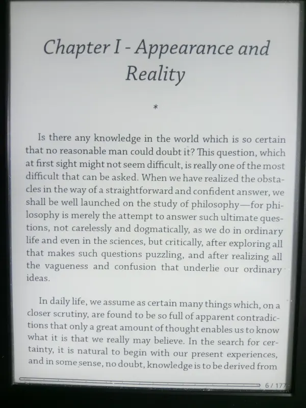
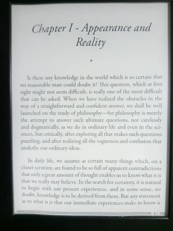
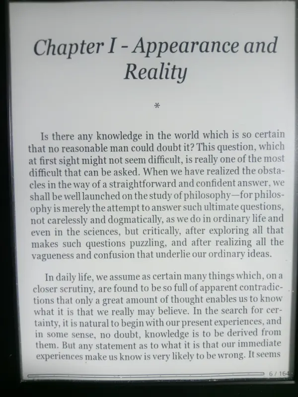
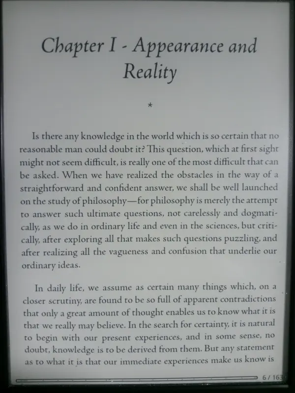
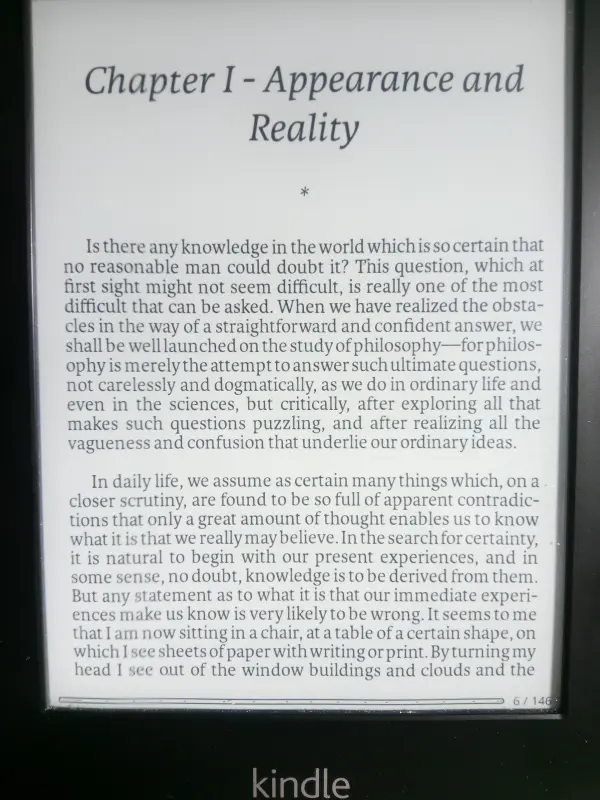
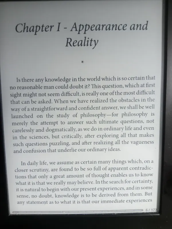
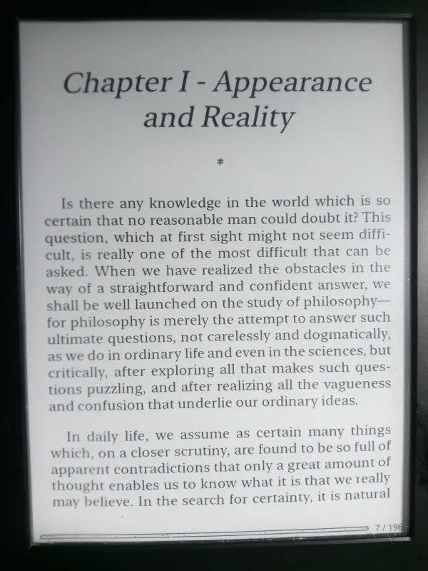
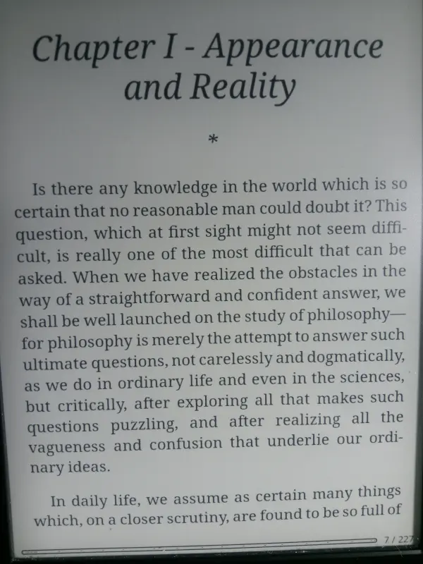
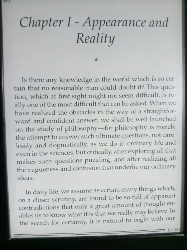
Today, I thought I’d see how different fonts are rendered on e-ink screens. I’ve used fifteen fonts that I have on a Kindle Paperwhite 1. Why did I use the Paperwhite 1, you may ask? As it’s an old device now, if a font looks good on that, then it’ll look even better on a newer device.
My criteria for selecting the fonts for testing was based on my own experience using them, their historical importance, or whether they’re pre-installed on devices. Some kept popping up in threads asking people what their favourite Kindle font is (yep, there are lots of them)! A couple are ones I’ve been using for many years and may not be particularly well known.
Rightly or wrongly, I only use serif fonts for reading, so there are no sans fonts here.
All photos were taken with the Kindle light turned off, in good daylight. I’m using KOReader and the book is The Problems of Philosophy by Bertrand Russell. The fonts are arranged alphabetically and linked to full resolution files on Flickr.
Abril
Athelas
Bembo
Bookerly
Caslon Pro
Chapparal Pro
Garamond Pro
Georgia Pro
Jenson Pro
Karmina
Literata
Minion Pro
New York Small
Noto Serif
Palatino
Conclusion
I’m not going to rate or judge these typefaces, so there are no winners or losers. After all, what I like may not be what you like. Generally speaking though, fonts like Bembo, Caslon, Garamond, Jenson are well suited to reading literary classics, philosophy, histories etc. as many physical books use them. They evoke a particular mood thanks to their long history and influences.
Bookerly and Literata have been designed specifically for ereading and either can be safely used as your default font.
Noto Serif is the default serif in KOReader and it’s also very legible and comfortable to use.
