
Ready for 2025
Since I started intermittently blogging again in 2020, I haven’t really done much style-wise with this site. I use the static site generator, Pelican, and a theme called Pelican Paper (details and links on my About page). To be fair, Pelican Paper is good to go straight out of the box. However, I’m a fussy little so-and-so and had some things I wanted to change. As business is a bit quiet this time of year, I decided to tackle it.
Self Hosted Fonts
Over the last few years I’ve been self hosting Google fonts on my servers for my Python projects. Unlike a few years ago, doing this takes about 15 minutes today. I view fonts as just another asset like a stylesheet, an image, an html file. Might as well host it myself. Here, I’m using Crimson Pro for headings, Public Sans for body text, JetBrains Mono for code. I think these fonts go really well together.
Adding Post Images / Logos
Many of my posts were just text, which is fine, but I think some are better with an image or a logo (if the post is about a specific product, platform or software). I’ve been doing this over a few days, and I think the backlog is now cleared.
Improving Organisation of Post Images
I’ve written a dedicated post about this here. Have a read if you’re interested.
Better Pagination
Pagination was set at ten posts per page. I’ve increased that to twenty five. I don’t like clicking buttons unnecessarily, and I’m sure you don’t either.
Take Atom Feeds More Seriously
The static site generator I use: Pelican, has always generated atom feeds. Until now, I’d paid no attention to them. I’m now looking into how these will help notify readers about posts which get frequently updated (see below). Once I’m au fait with how these operate, I’ll write a post on the topic.
Make Use of Post Modified Date
I’m also trying to be a bit more disciplined about keeping track of when I last modified a post. For example, my post about getting banned from linkedin which I originally wrote in 2021, has been updated this month with a bit more text and some images. Same with my review post of Drake’s tobacco concentrates.
Styled Footnotes
I’ve become quite a fan of footnotes lately. The problem can be that they’re hard to see on the page. I’ve decided to make mine blue and add a bit of padding. Again, I’m quite chuffed with how they now look.1
Better Styled <mark> Tag
I find the default mark styling a little bit too yellow. I was after something a little bit more subtle, but still eye catching. Quickly found, and copied this style from A Beautiful Site. Very happy with how this looks.
Version CSS Files to Force Browser Refresh When Updated
As I have Apache set to cache assets such as css and js files set to access +1 month any changes I made weren’t visible, unless a visitor has the option to disable cache. I was going to reduce the duration down to a week but thought there must be a better way. There is!
All I had to do was append a version number. Then when a browser looks in it’s cache, it notices the cached one is stale and downloads the new one. In my case, this meant just renaming paper.css to paper-1.0.css. Tested on my Android mobile (which doesn’t seem to have a disable cache option), and it works great.
Improve Appearance of Tags
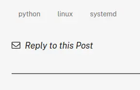
The default appearance of tags at the bottom of an article was quite hard to see:
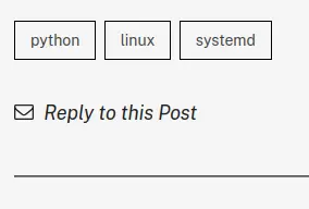
So I put a border around them and made the font slightly darker:
Add Some Nav Links
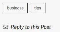
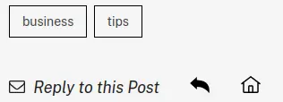
Decided to add a back link and a home link next to reply to this post on article page.
Old:
New:
Implement an Update Policy
I’m using the word policy liberally here. I’ve written a post about managing blog post updates but at the time of writing that one, I hadn’t made my mind up entirely. My policy now is that when I update a post, the modifed / updated date is displayed beneath the original publication date, highlighted by an aserisk. At the bottom of the page, I have an Updates section, with a brief summary of what was added or removed on a particular date.
More Icons
I like icons as they convey information quickly to a reader.
This is a question header
Here’s what we have covered
I’ve had an idea
This is important (it’s not but could have been).
I’ll probably add a few more. You guessed it. Info icon.
This is new and exciting!
Future Changes
I might decrease the margins on some templates. In particular, on mobile I think there’s a bit too much whitespace on the sides on the index page with the new fonts.
Footnotes
1 Just a demo of the new style.
Updates
2025-01-09: Add Add some nav links section.
2025-01-04: Add More Icons section.
2025-01-03: Add Implement an Update Policy section.
2025-01-01: Add Improve appearance of tags section.
2024-12-31: Add Version CSS Files to Force Browser Refresh When Updated section. Also add this Updates section to match what I do on other posts. See this post for details.